先輩!記事一覧の作り方が全く見えてきません!
OK、俺様トップページでよく見る記事一覧の作り方を教えて
(聞く人間違えたな)
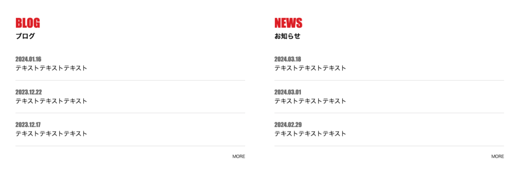
今回の完成品
それでは今回の完成品を見ていきましょう。
下記画像のようにトップページなどでよく見る記事一覧ですね。
各記事をクリックすると詳細にとべる部分となっております。
今回はBLOGとNEWSをflexで横並びにしてるけど、flexを外して片側だけでもOK
記事一覧のコード
それでは実際にコードを見ていくぞ!
  <div class="p-post__inner">
    <div class="p-post__container">
      <div class="p-post__block">
        <h2 class="p-post__title" data-en="BLOG">ブログ</h2>
        <ul class="p-post_items">
          <li class="p-post__item">
            <a href="" class="p-post__link">
              <time class="p-post__date" datetime="2024.1.16">2024.01.16</time>
              <p class="p-post__text">テキストテキストテキスト</p>
            </a>
          </li>
          <li class="p-post__item">
            <a href="" class="p-post__link">
              <time class="p-post__date" datetime="2023.12.22">2023.12.22</time>
              <p class="p-post__text">テキストテキストテキスト</p>
            </a>
          </li>
          <li class="p-post__item">
            <a href="" class="p-post__link">
              <time class="p-post__date" datetime="2023.12.17">2023.12.17</time>
              <p class="p-post__text">テキストテキストテキスト</p>
            </a>
          </li>
        </ul>
        <div class="p-post__btn"><a href="">MORE</a></div>
      </div>
      <div class="p-post__block">
        <h2 class="p-post__title" data-en="NEWS">お知らせ</h2>
        <ul class="p-post_items">
          <li class="p-post__item">
            <a href="" class="p-post__link">
              <time class="p-post__date" datetime="2024.3.18">2024.03.18</time>
              <p class="p-post__text">テキストテキストテキスト</p>
            </a>
          </li>
          <li class="p-post__item">
            <a href="" class="p-post__link">
              <time class="p-post__date" datetime="2024.3.1">2024.03.01</time>
              <p class="p-post__text">テキストテキストテキスト</p>
            </a>
          </li>
          <li class="p-post__item">
            <a href="" class="p-post__link">
              <time class="p-post__date" datetime="2024.2.29">2024.02.29</time>
              <p class="p-post__text">テキストテキストテキスト</p>
            </a>
          </li>
        </ul>
        <div class="p-post__btn"><a href="">MORE</a></div>
      </div>
    </div>
  </div>
.p-post__inner {
padding-bottom: 2rem;
}
@media screen and (min-width: 767px) {
.p-post__inner {
max-width: 1200px;
width: 100%;
padding-top: 6rem;
padding-bottom: 4rem;
}
}
.p-post__container {
display: block;
}
@media screen and (min-width: 767px) {
.p-post__container {
display: flex;
justify-content: space-between;
}
}
.p-post__block {
width: 100%;
}
@media screen and (min-width: 767px) {
.p-post__block {
width: 47%;
}
}
.p-post__block+.p-post__block {
margin-top: 4rem;
}
@media screen and (min-width: 767px) {
.p-post__block+.p-post__block {
margin-top: 0;
}
}
.p-post__title {
color: #000;
font-weight: 800;
line-height: 1;
font-size: 1.5rem;
}
@media screen and (min-width: 767px) {
.p-post__title {
font-size: 1.6rem;
}
}
.p-post__title::before {
content: attr(data-en);
display: block;
color: #D72020;
font-family: "impact", sans-serif;
font-size: 2.4rem;
font-weight: 700;
color: #D72020;
margin-bottom: 1rem;
}
@media screen and (min-width: 767px) {
.p-post__title::before {
font-size: 3rem;
}
}
.p-post_items {
margin-top: 1rem;
}
@media screen and (min-width: 767px) {
.p-post_items {
margin-top: 2rem;
}
}
.p-post__item {
display: block;
border-bottom: solid 1px #e0e0e0;
}
.p-post__link {
display: block;
padding-top: 1rem;
padding-bottom: 1rem;
width: 100%;
}
@media screen and (min-width: 767px) {
.p-post__link {
padding-top: 2rem;
padding-bottom: 2rem;
}
}
@media (hover: hover) {
.p-post__link:hover {
opacity: 0.4;
}
}
.p-post__date {
color: #757575;
font-size: 1rem;
font-family: "impact", sans-serif;
font-weight: 700;
}
@media screen and (min-width: 767px) {
.p-post__date {
font-size: 1.5rem;
}
}
.p-post__text {
margin-top: 0.5rem;
font-size: 1.4rem;
color: #000;
display: -webkit-box;
-webkit-line-clamp: 2;
-webkit-box-orient: vertical;
overflow: hidden;
text-overflow: ellipsis;
font-weight: 500;
}
@media screen and (min-width: 767px) {
.p-post__text {
font-size: 1.5rem;
}
}
.p-post__btn {
margin-top: 2rem;
}
.p-post__btn a {
text-decoration: none;
justify-content: flex-end;
display: flex;
}長い・・圧倒的に長い!!!!!!!!
これは理解が
確かに長いけど、ほとんどがテキストの大きさやフォントの調整、各要素間の余白の調整などがほとんどだ!
今回は全体の構成と各ポイントを抑えていこう!
  .p-post__inner {
    max-width: 1200px;
}.p-post__innerは全体を包み込んでいる要素です。
max-width: 1200px;は、要素の最大幅を1200ピクセルに設定し、要素が1200ピクセルよりも幅が広くならないように制限します。
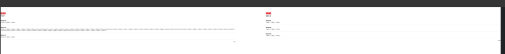
下記画像はモニターサイズを横5000pxにしたものです。
max-widthで横幅の上限を設定しないと、このように幅が許す限りひたすら横に伸びていき、とても見にくい状態になってしまいます。
  .p-post__container {
    display: flex;
    justify-content: space-between;
}
.p-post__containerは【BLOG】と【NEWS】ブロックを包んでいる要素です。
display: flex;を使用し、子要素(【BLOG】と【NEWS】)を水平方向に並べることができます。
justify-content: space-between;は、子要素を水平方向に均等に配置し、間に余白を挿入します。
.p-post__text {
  display: -webkit-box;
  -webkit-line-clamp: 2;
  -webkit-box-orient: vertical;
  overflow: hidden;
  text-overflow: ellipsis;
}
こちらのプロパティはテキスト部分を制御する内容となっています。
まずは各プロパティの説明をしていきましょう
-webkit-line-clamp: 2;-webkit-line-clamp: 2;は、Webkit系ブラウザ(主にChromeやSafari)で使用されるCSSプロパティで、指定した行数にテキストを切り詰めます。- この場合、
-webkit-line-clamp: 2;はテキストを2行で切り詰め、それ以上の行は表示されません。
-webkit-box-orient: vertical;-webkit-box-orient: vertical;は、Webkit系ブラウザでフレックスボックスの方向を垂直(縦方向)に指定します。
overflow: hidden;overflow: hidden;は、要素からはみ出したコンテンツを表示せずに隠します。
text-overflow: ellipsis;text-overflow: ellipsis;は、テキストが要素からはみ出た場合に省略記号(…)を表示します。
いかがでしたでしょうか?
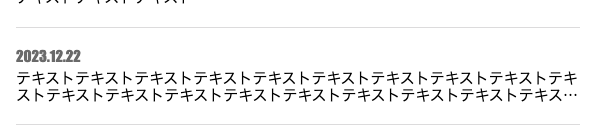
イメージがつきにくいと思うので、実際に画像で見てみましょう。
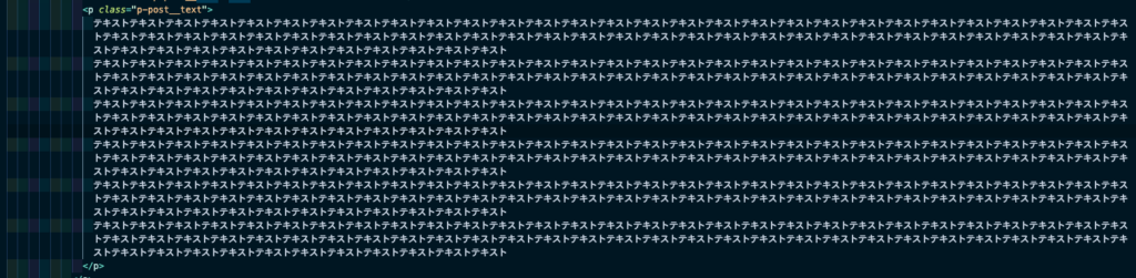
今回、このようにテキスト部分におびただしい量の【テキスト】を入れました。
普通ならブラウザにとてつもない量のテキストが表示されますが、画像と通り2行で区切られ超えた部分は・・・で省略されています。
まとめ
いかがでしたでしょうか。
今回はトップページでよく見る投稿一覧ブロックの解説でした。
全体の幅の上限とテキストの制御がメインとなります、ぜひ皆さんも作って見てください。