適当にCTAを作っといてって・・・CTAって誰だ・・
CTAって言葉はあまり聞きなれない言葉だね
今回はCTAの説明とコーディング方法を解説していくね
そもそもCTAとは
そもそもCTAというのは「読者に具体的な行動を促し、目的達成に導く要素」です!
記事やサイトを読んでいて、興味を惹いた方がそのままアクション(資料請求・応募など)をしてもらう要素だね、下記に詳細を解説するよ
CTA(Call to Action)は、ウェブサイトやブログ記事などのコンテンツ中に配置される、特定の行動を促す要素です。
例えば、「今すぐ購入する」「無料トライアルを始める」「メルマガに登録する」といった具体的な行動を読者に促すためのリンクやボタンがCTAとして機能します。
CTAは読者に対して行動を起こさせるための強力なツールであり、効果的なCTAはコンバージョン率の向上につながります。
そのため、CTAの設計や配置は重要で、CTAは明確でわかりやすく、読者がすぐに行動を起こせるように設計されることが多いです。
例えば、ブログ記事の最後に関連する製品やサービスへのリンクを設置し、「詳細を見る」「購入する」などのCTAを追加することで、読者に興味を持ってもらいやすくなります。
CTAは文章やデザインによっても効果が異なるため、継続的なテストや最適化が重要です。
なるほど!読んで終わりじゃくて、そこから売上や顧客獲得につながるように仕向けているんだね!
今回作る完成形
CTAを理解したら、実際に今回作るCTAを見てみよう!
今回は縦と横、両方のレイアウトを用意したよ!
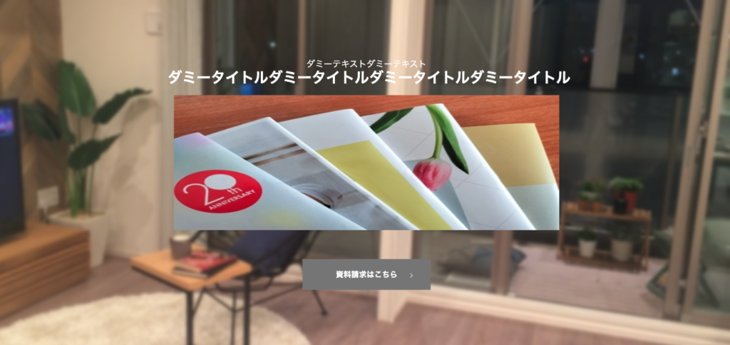
cta 縦のレイアウトデザイン
画像がダサく、余白も微妙ですがご了承ください。
ご自身で試す際にいい感じの画像とmarginをおとりください
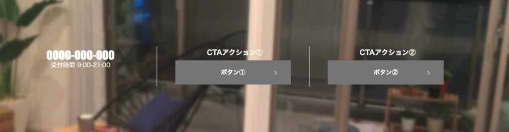
cta 横のレイアウトデザイン
CTAのコードと解説
cta 縦のレイアウトのコード解説
  <div class="p-cta">
    <div class="p-cta__inner">
      <div class="p-cta__block">
        <p class="p-cta__text">ダミーテキストダミーテキスト</p>
        <p class="p-cta__title">ダミータイトルダミータイトルダミータイトルダミータイトル</p>
      </div>
      <div class="p-cta__block">
        <picture>
          <source media="(min-width: 768px)" srcset="siryou.jpg">
          <img src="siryou.jpg" alt="">
        </picture>
      </div>
      <div class="p-cta__block">
        <div class="p-cta__btn">
          <a href="">資料請求はこちら<span class="arrow"></span></a>
        </div>
      </div>
    </div>
  </div>
.p-cta {
padding-top: 15rem;
padding-bottom: 15rem;
color: #fff;
position: relative;
overflow: hidden;
}
.p-cta::before {
content: '';
background: url("bg_works_pc.jpg") no-repeat center center/cover;
position: absolute;
top: 0;
left: 0;
width: 100%;
height: 100%;
-webkit-filter: blur(3px);
filter: blur(3px);
z-index: -1;
}
.p-cta__inner {
display: block;
margin: 0 auto;
}
@media screen and (min-width: 768px) {
.p-cta__inner {
max-width: 1000px;
}
}
.p-cta__block {
padding-top: 3rem;
padding-bottom: 4rem;
width: 100%;
text-align: center;
}
@media screen and (min-width: 768px) {
.p-cta__block {
padding-top: 0.5rem;
padding-bottom: 0.5rem;
}
}
.p-cta__title {
font-size: 1.8rem;
font-weight: 700;
margin-bottom: 1rem;
}
.p-cta__btn {
color: #fff;
text-align: center;
max-width: 350px;
margin: 0 auto;
margin-top: 5rem;
}
.p-cta__btn a {
position: relative;
display: inline-flex;
align-items: center;
justify-content: center;
padding: 1.5em 1em;
font-size: 1.6rem;
font-weight: 700;
width: 100%;
line-height: 1;
width: 76%;
background-color: grey;
border-color: grey;
}
.arrow {
background: url(icon_arrow_white.svg) no-repeat center center / contain;
content: "";
position: absolute;
display: inline-block;
top: 45%;
right: 3rem;
right: 3rem;
width: 2rem;
height: 1rem;
transition: 0.3s;
}
.p-cta__title {
font-size: 3rem;
font-weight: bold;
font-family: Impact, Haettenschweiler, sans-serif;
}
.p-cta__text {
font-size: 1.8rem;
font-weight: normal;
}基本的に縦のレイアウトは難しくありません。
タイトル、画像、ボタンの3段階で分かれており、基本的にはflexやgridなどで制御する必要はなく、各ブロックをそのまま上から下に配置するだけで問題はありません。
抑えるべきポイントとしては2つ下記のctaの背景画像とインナーの制御です。
/*CTAブロックの背景画像の設定*/
.p-cta {
  position: relative;
  overflow: hidden;
}

.p-cta::before {
  content: '';
  background: url("bg_works_pc.jpg") no-repeat center center/cover;
  position: absolute;
  top: 0;
  left: 0;
  width: 100%;
  height: 100%;
  -webkit-filter: blur(3px);
  filter: blur(3px);
}


/*インナー幅の設定と要素の真ん中寄せ*/

.p-cta__inner {
  margin: 0 auto;
}

@media screen and (min-width: 768px) {
  .p-cta__inner {
    max-width: 1000px;
  }
}
今回、ctaの背景画像をぼかして配置しているので、ぼかす為にfilterプロパティをかけています。
しかし、こちらのプロパティを直接p-ctaにかけると、中のテキストやボタンもぼやけてしまうので、擬似要素のbeforeをかけ、別レイヤーとして配置しております。
そうすることによって背景画像のみにfilterがかかり、背景のみぼかしがかかっています。
また、filterでぼかしをかけると画像の上下左右の端もぼやけてしまい、境界線が見づらくなります。
なので、元のp-ctaにoverflow:hidden;をかけることで、ぼかしを切り取っています。
インナー幅に関してはmax-widthをかけることで、画像やテキスト、ボタンが横に広がるのを制御し、margin:0 auto;で真ん中に全体を配置しています。
cta 横のレイアウトのコード解説
  <div class="p-cta">
    <div class="p-cta__inner">
      <div class="p-cta__block">
        <a class="p-cta__tel" href="">0000-000-000</a>
        <p class="p-cta__text">受付時間 9:00-21:00</p>
      </div>
      <div class="p-cta__block">
        <p class="p-cta__title">CTAアクション①</p>
        <div class="p-cta__btn">
          <a href="">ボタン①<span class="arrow"></span></a>
        </div>
      </div>
      <div class="p-cta__block">
        <p class="p-cta__title">CTAアクション②</p>
        <div class="p-cta__btn">
          <a href="">ボタン②<span class="arrow"></span></a>
        </div>
      </div>
    </div>
  </div>
.p-cta {
padding-top: 15rem;
padding-bottom: 15rem;
color: #fff;
position: relative;
overflow: hidden;
}
.p-cta::before {
content: '';
background: url("bg_works_pc.jpg") no-repeat center center/cover;
position: absolute;
top: 0;
left: 0;
width: 100%;
height: 100%;
-webkit-filter: blur(3px);
filter: blur(3px);
z-index: -1;
}
.p-cta__inner {
display: block;
}
@media screen and (min-width: 768px) {
.p-cta__inner {
display: flex;
max-width: 1200px;
margin: 0 auto;
}
}
.p-cta__block {
padding-top: 3rem;
padding-bottom: 4rem;
width: 100%;
text-align: center;
}
@media screen and (min-width: 768px) {
.p-cta__block {
width: 33.3333%;
padding-top: 0.5rem;
padding-bottom: 0.5rem;
}
}
.p-cta__block:nth-child(1),
.p-cta__block:nth-child(2) {
border-bottom: solid 1px #fff;
}
@media screen and (min-width: 768px) {
.p-cta__block:nth-child(1),
.p-cta__block:nth-child(2) {
border-right: solid 1px #fff;
border-bottom: none;
}
}
.p-cta__title {
font-size: 1.8rem;
font-weight: 700;
margin-bottom: 1rem;
}
.p-cta__title::before {
content: "";
display: inline-block;
margin-right: 1rem;
position: relative;
top: 0.5rem;
}
.p-cta__btn {
color: #fff;
text-align: center;
}
.p-cta__btn a {
position: relative;
display: inline-flex;
align-items: center;
justify-content: center;
padding: 1.5em 1em;
font-size: 1.6rem;
font-weight: 700;
width: 100%;
line-height: 1;
width: 76%;
background-color: grey;
border-color: grey;
}
.arrow {
background: url(icon_arrow_white.svg) no-repeat center center / contain;
content: "";
position: absolute;
display: inline-block;
top: 45%;
right: 3rem;
right: 3rem;
width: 2rem;
height: 1rem;
transition: 0.3s;
}
.p-cta__tel {
font-size: 3rem;
font-weight: bold;
font-family: Impact, Haettenschweiler, sans-serif;
}
.p-cta__text {
font-size: 1.6rem;
font-weight: normal;
}横のレイアウトの背景画像などは縦のレイアウトと全く一緒です。
相違としましては、全体のレイアウトを横並びにするためのdisplay:flex;がかかっていることです。
.p-cta__block {
  width: 100%;
}

@media screen and (min-width: 768px) {
  .p-cta__block {
    width: 33.3333%;
  }
}
全体をdisplay:flex;で囲んだ際の注意点として、子要素に対して横幅の大きさの設定が必要です。
今回はパソコン表示の際にはwidth:33%;、スマートフォンの表示の時には100%をかけてます。
まとめ
今回はCTAブロックの縦のレイアウトと横のレイアウトのコーディングを解説いたしました。
構造はシンプルですが、どのサイトやLPでも見かけるので、自分用にパーツ化しておくと便利です。